Apple’s Human Interface Guidelines (HIG) serve as a roadmap for designing intuitive, responsive, and accessible iOS apps. The four core principles that developers must apply are clarity, deference, depth, and consistency.
Clarity ensures intuitive and user-friendly interactions that users can navigate without confusion or frustration. iOS apps should have a clean and uncluttered layout, ample white space, and as few elements as possible to avoid overwhelming users. Clear labels, straightforward icons, readable typography, clear visual hierarchy, and effective use of white space contribute to clarity.
Deference ensures that users know how to interact with content through a clean interface with fluid motions. A clean interface minimizes distractions, while fluid motions make navigation seamless and intuitive. Depth enhances deference by creating a visual hierarchy, distinguishing between supporting content and primary actions through layering and subtle shadows.
Depth infuses vitality into an application by directing user attention via visual cues like blurs, transparency, and shadows. It creates a sense of hierarchy and dimension within the UI, helping users separate interactive elements from static objects. Techniques like shadows, scaling, and layering create a three-dimensional sense of space.
Consistency is fundamental for a native iOS app, maintaining uniformity and cohesiveness throughout the interface. It reduces learning curves, enhances predictability, reinforces brand identity, and fosters familiarity and trust. Consistency should be maintained in UI elements, typography, colors, interactions, and adherence to iOS design patterns.
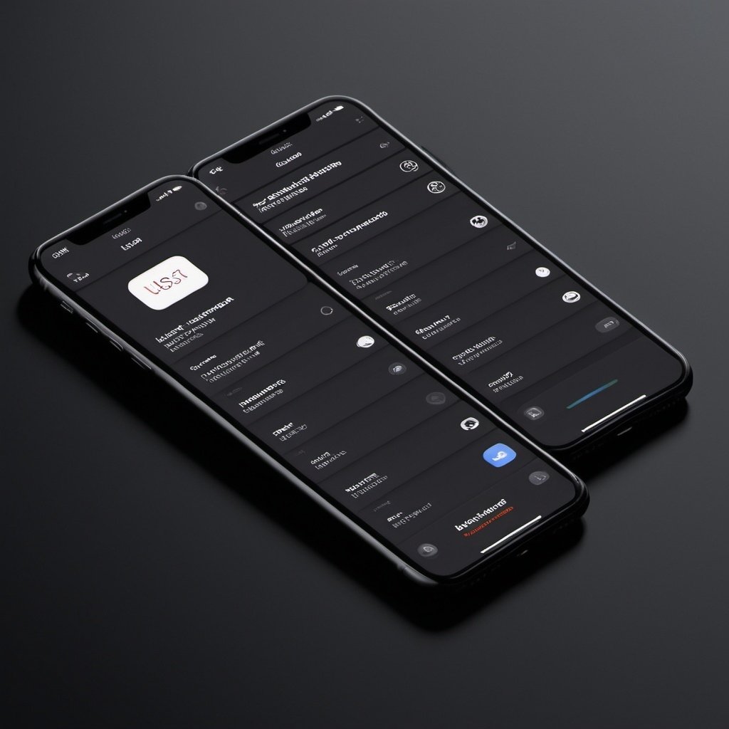
Layout and Structure
The arrangement and framework of an iOS app, including navigation, interface components, typography, and color schemes, are crucial considerations. Apple offers a wide variety of suggestions and controls for building interfaces quickly, but developers may opt for custom UI elements in some cases.
Navigation is the cornerstone of a good iOS app, ensuring users can easily navigate through different sections and features. There are several navigation models to choose from, such as hierarchical, flat, and content or experience-driven navigation. Regardless of the model, clear navigation paths using familiar iOS patterns like bars (status bar, navigation bar, search bar, tab bar) are essential.
Interface Elements like buttons, pickers, sliders, steppers, and switches are the building blocks of an app’s interface. Developers should consider creating personalized interface components to enhance usability and create a unique experience while adhering to iOS standards to avoid user confusion.
Typography is necessary for establishing visually appealing language, highlighting essential content, conveying brand identity, and clarifying hierarchical information. Apple’s San Francisco font (SF Pro Display for UI components and SF Pro Text for longer text) is recommended for iOS apps, but developers may customize typography while considering factors like legibility, font pairing, size consistency, and hierarchy.
Color contributes to the overall look and feel of an app, evokes user emotions, assists with navigation, and reinforces brand identity. iOS offers semantic color sets (primary, secondary, tertiary) for different purposes like backgrounds, fills, labels, separators, and functional colors. Consistency within the chosen color palette is key, aligning with the brand and app’s purpose while fitting harmoniously with the iOS ecosystem.
User Interaction
User experience and user interface design are major factors influencing user engagement, covering areas like touch mechanics, accessibility, feedback, and animation and motion.
Touch Mechanics involve user interactions and gestures, which should be intuitive, consistent, easy to learn and remember, and respect the current mental model of users. Developers should provide feedback for each gesture, avoid interfering with system gestures, and consider soliciting gestures instead of text input where possible.
Accessibility design ensures that every feature of an app is usable and accessible, accommodating diverse users and their visual, motor, cognitive, and auditory needs. This involves providing assistive technologies like VoiceOver, Dynamic Type, clear and high-contrast text, captions and descriptions for media, and logical layout and navigation.
Feedback provides users with responses to their actions, acknowledging their interactions and building confidence and trust in the app. Examples include visual feedback (color changes), haptic feedback, loading indicators, error messages, and action confirmations.
Animation and Motion communicate and enhance feedback, showing users how things change within the app and what will happen when they perform certain actions. Animations should be realistic, credible, brief, and precise, while also being optional for users who prefer to reduce or disable them.
Advanced Design Techniques
Once developers decide on the basics of their iPhone apps, they should consider advanced design approaches like dark mode themes, augmented reality, and machine learning.
Dark Mode is an iOS appearance setting that applies a dark color palette to the app’s screens, menus, and controls. Designers should create a version of their app suitable for dark mode, with a dark color palette and contrasting elements that automatically switch when the user changes their system settings.
Augmented Reality (AR) allows developers to create immersive experiences that blend virtual objects with the real world using Apple’s ARKit framework. AR experiences should be designed for full-screen immersion, with realistic virtual objects, lifelike textures, and camera grain simulation. Audio and haptic feedback can enhance user interaction, while gradual movement encouragement and clear communication of environmental requirements are also important.
Machine Learning (ML) offers versatile possibilities like image recognition and content recommendation systems, helping users accomplish more with less effort. Apple’s Core ML tool simplifies ML integration, but developers should consider challenges like data privacy and security concerns, user trust, limited computational resources, and performance optimization techniques.
User Testing: Refining UX and UI Elements
User testing involves having real users evaluate the app’s functionalities and identify usability issues before launch. Methods include:
- A/B testing: Creating two versions of a feature and seeing which performs better with different users.
- Beta testing: Releasing a working version to a small group of users to identify bugs or major issues before the official launch.
- Surveys and feedback forms: Collecting information on general app impressions and specific features or issues.
- Analytics: Using tools to collect data on user interactions, popular features, usage patterns, and more.
Conclusion
Designing successful iOS apps requires hard work, research, and adherence to Apple’s HIG and iOS design guidelines, as well as accessibility guidelines. These guidelines offer tips and ideas for building accessible, functional, and user-friendly apps that stand out in the competitive Apple App Store. A successful design boosts user satisfaction with an intuitive, user-friendly, and accessible UI/UX while reflecting the business’ brand.